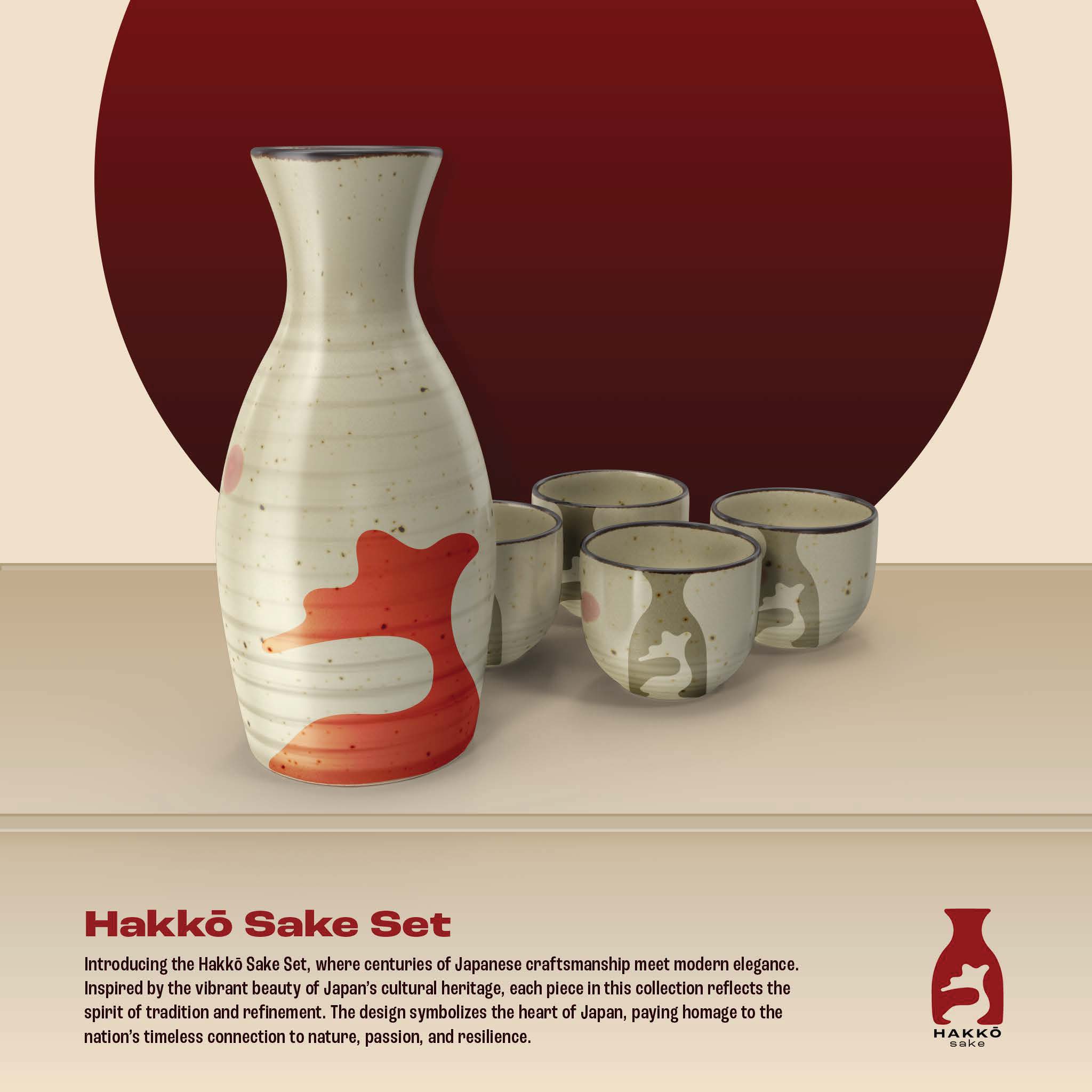
• About
    • Split Decisions
    • Jax Mural Project
    • UNF AAHD Rebrand
    • Millennium
    • Purl
    • The Arc
    • Tyler Poster Series
    • Front Porch Soap
    • Origin of Species
    • Hakkō Sake
contact me

Hakkō Sake

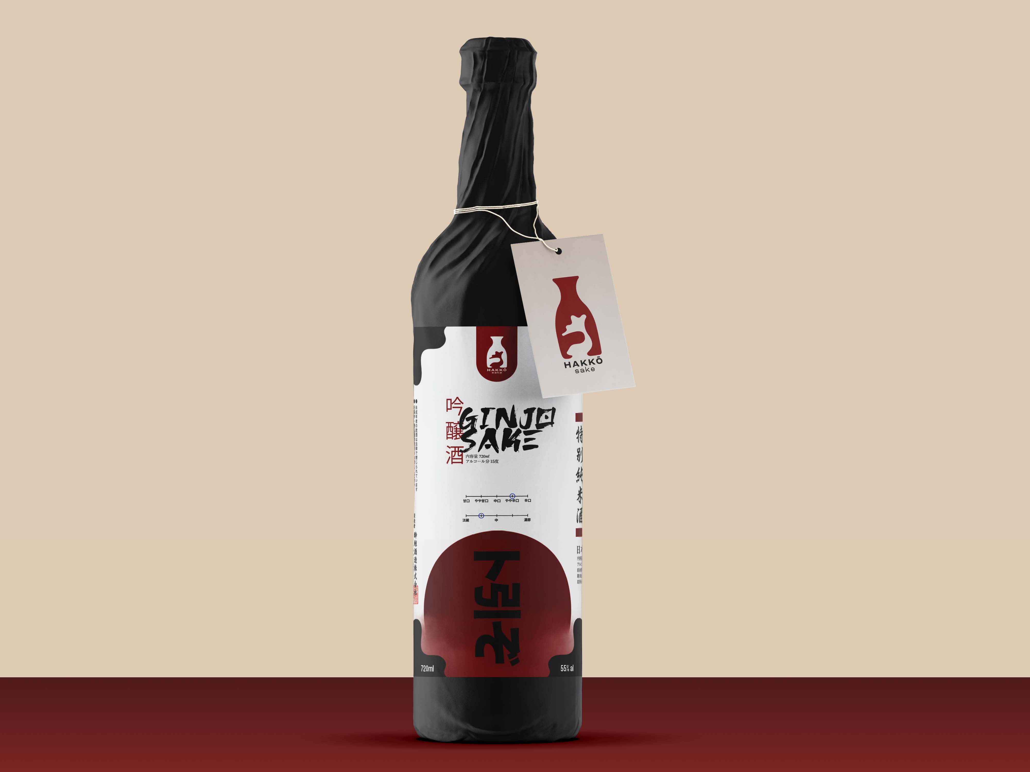
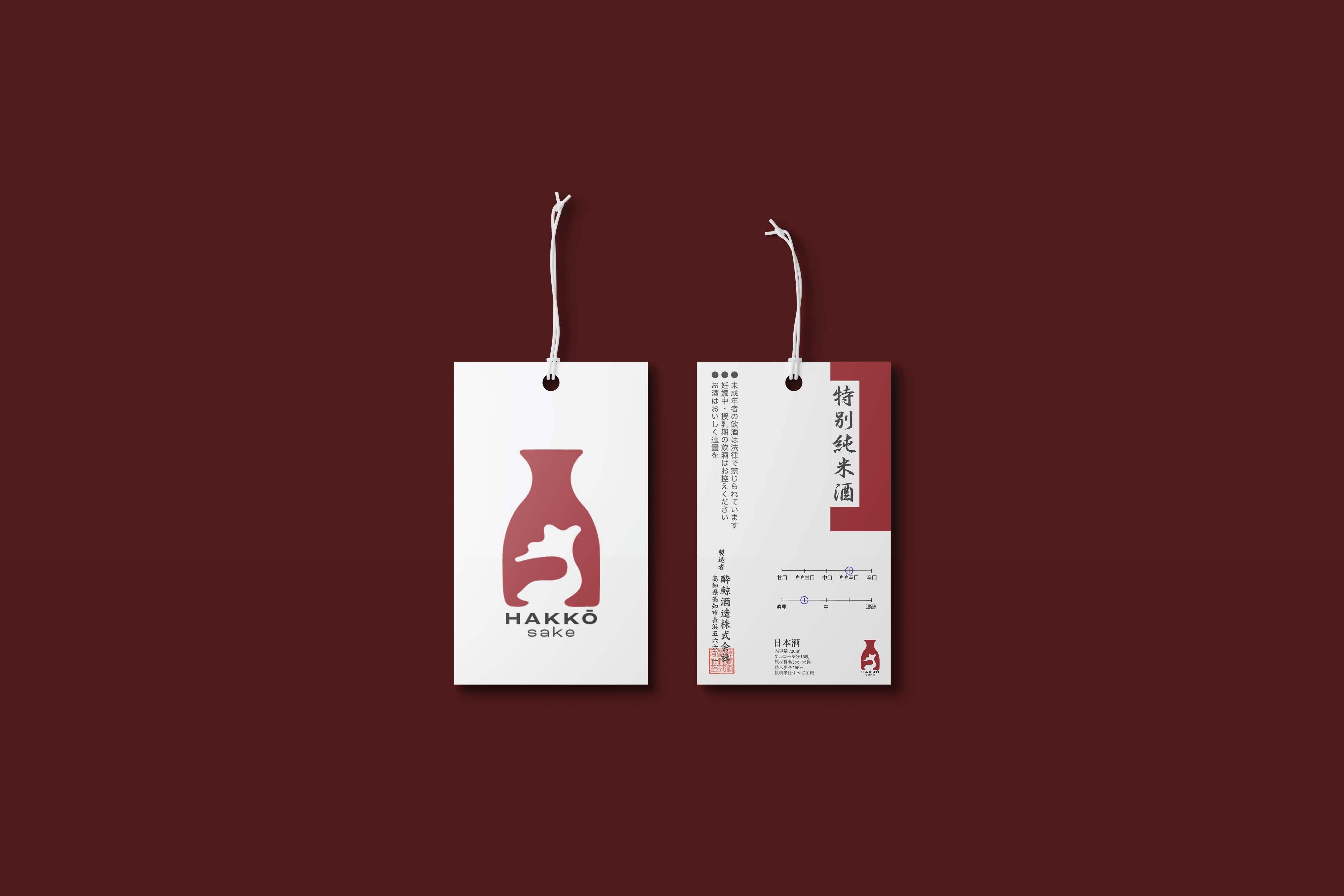
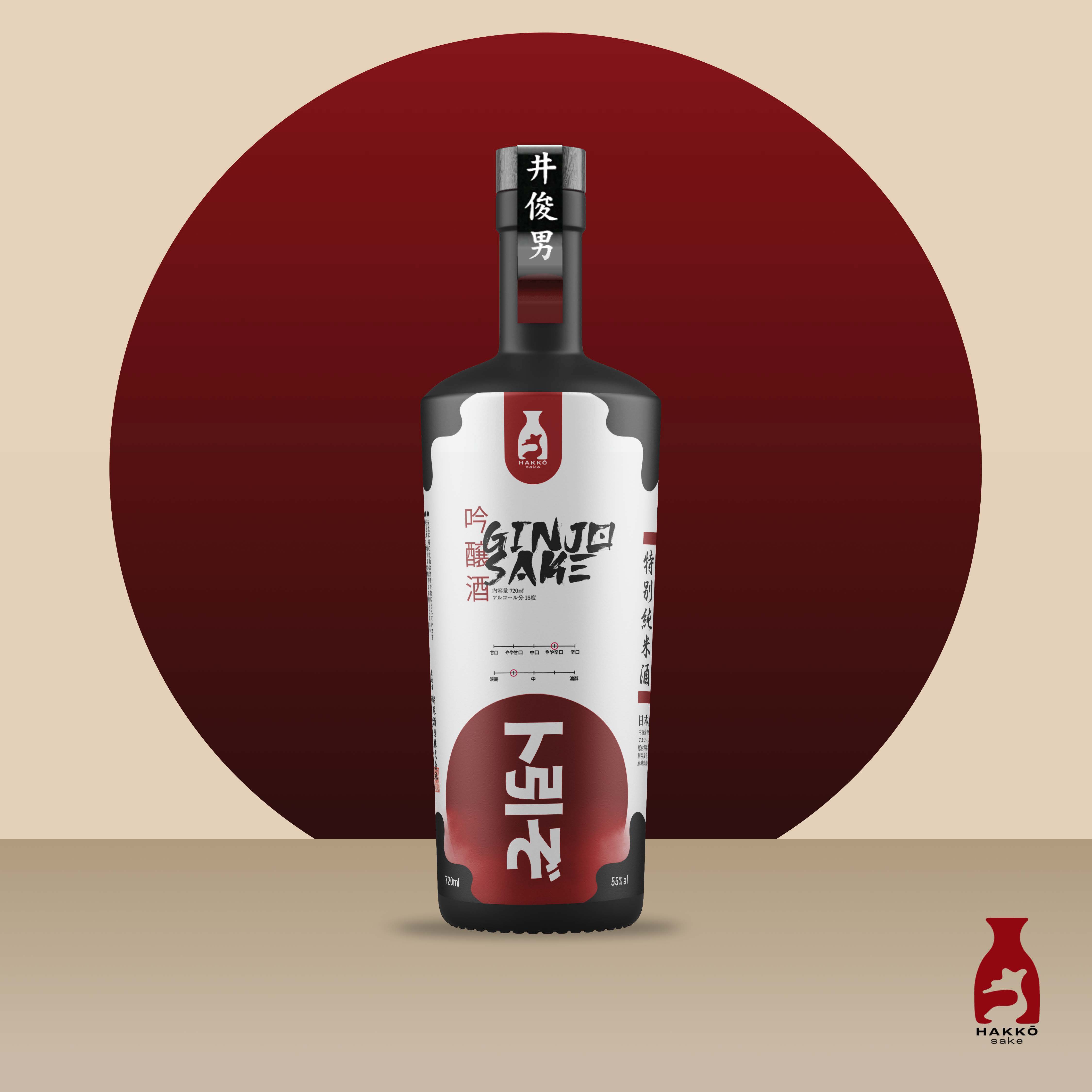
  • brand concept / packaging

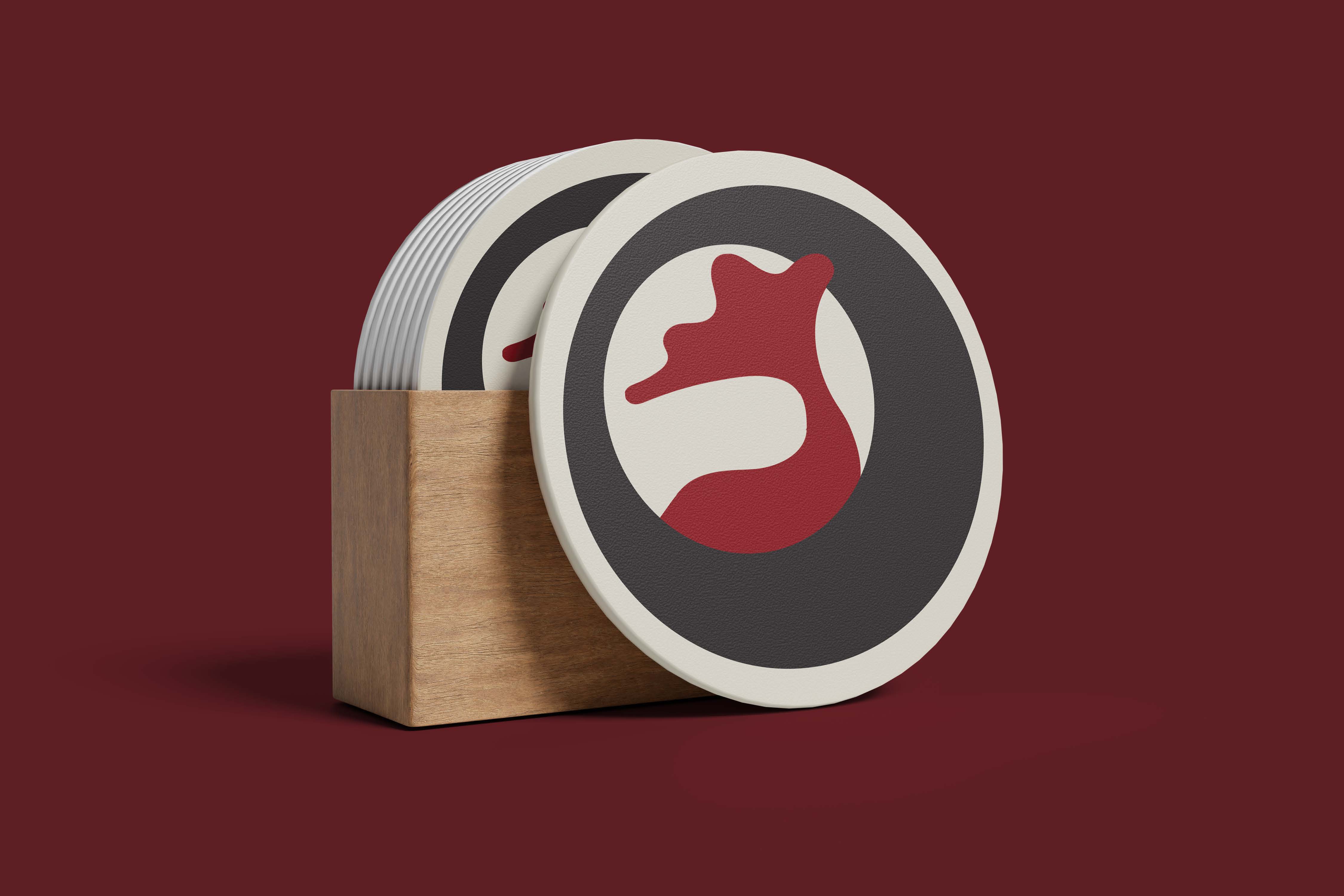
    In Japan, the traditional sake pitcher happens to be the most common way that sake is enjoyed. This branding concept takes the shape that forms the body of a koi fish, paying homage to the traditional shape of the sake pitcher. The organic shape of the fish, visually commuicates that the subject has a bright, liquid quality.

Brand Color Palette

rice sake

#FFFDED

koi fin
#910811

fish scales

#231F20

Gallery


Let’s Work Together.

contact me

Designed with WordPress

clary.design
isabella@clary.design

  • Instagram
  • LinkedIn
  • Behance
  • Subscribe Subscribed
    • clary.design
    • Already have a WordPress.com account? Log in now.
    • clary.design
    • Subscribe Subscribed
    • Sign up
    • Log in
    • Copy shortlink
    • Report this content
    • View post in Reader
    • Manage subscriptions
    • Collapse this bar